![]()


Business Case / Need
Webfront Stores operated three ecommerce brands on the Monster Commerce platform. Their websites were using dated templates, not mobile-friendly, and visually inconsistent. The client needed a redesign that modernized the experience, introduced responsive layouts, incorporated refreshed branding, and created a sense of continuity across all three brands while staying within a specified budget.
My Role
As Project Manager, I led stakeholder communications, design reviews, and approvals. I managed timelines, queued production for three separate sites, and coordinated our internal traffic manager to align workloads. While the IA remained largely unchanged due to existing product catalogs, I provided direction on design priorities and navigation.
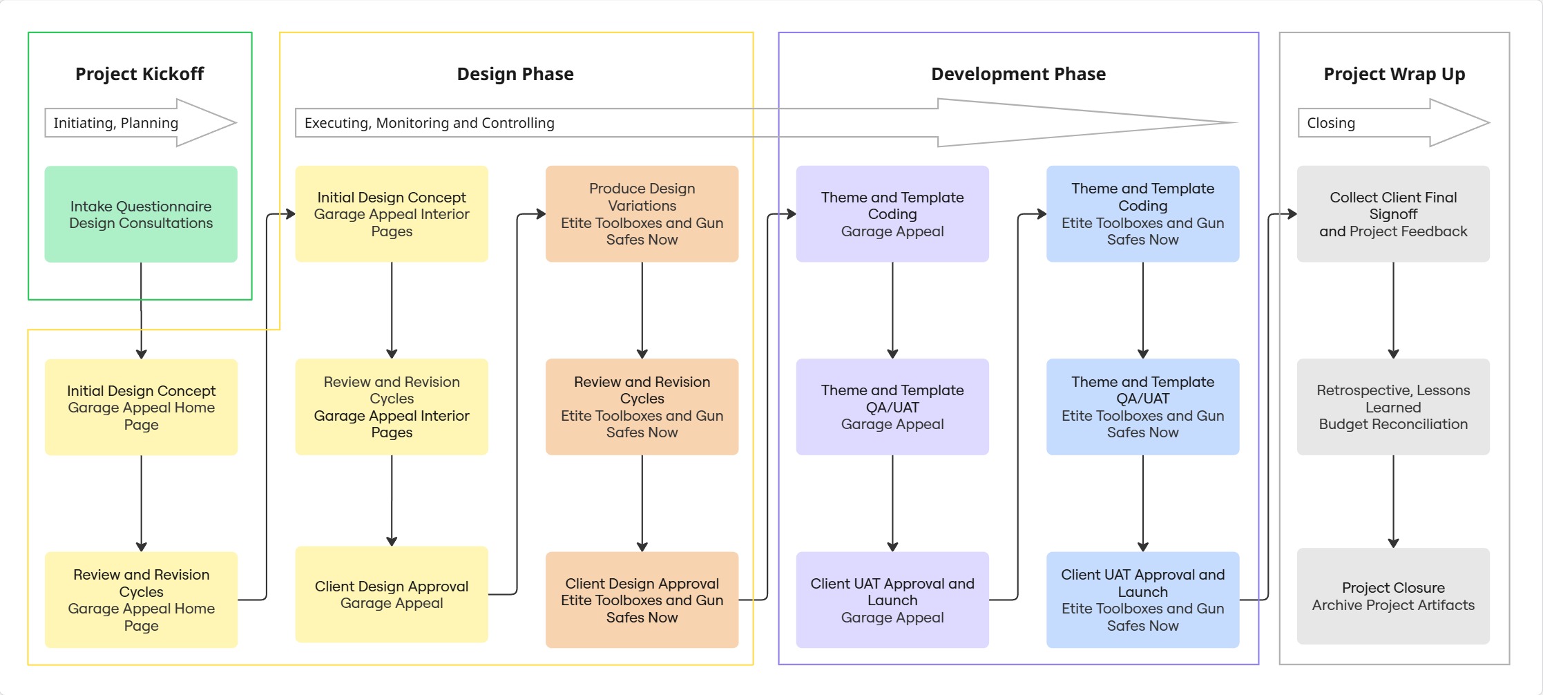
Project Approach
Following our predictive project process, we designed and developed the first brand’s site (Garage Appeal) in close collaboration with the business owner. This included utilizing an intake questionnaire to gather information about the business, its customers, and the brand guidelines, then iterating through a design mockup and revision phase. With the client approving the initial site design mockups, we produced separate versions for the other two sites (Gun Safes Now and Elite Toolboxes) with corresponding logo and brand colors.
We followed a similar approach with development, completing the coding for the first site, conducting quality and user acceptance testing, then implementing the new templates for the other sites. This approach allowed us to reuse core layouts and code, reducing production effort and delivering significant cost savings.
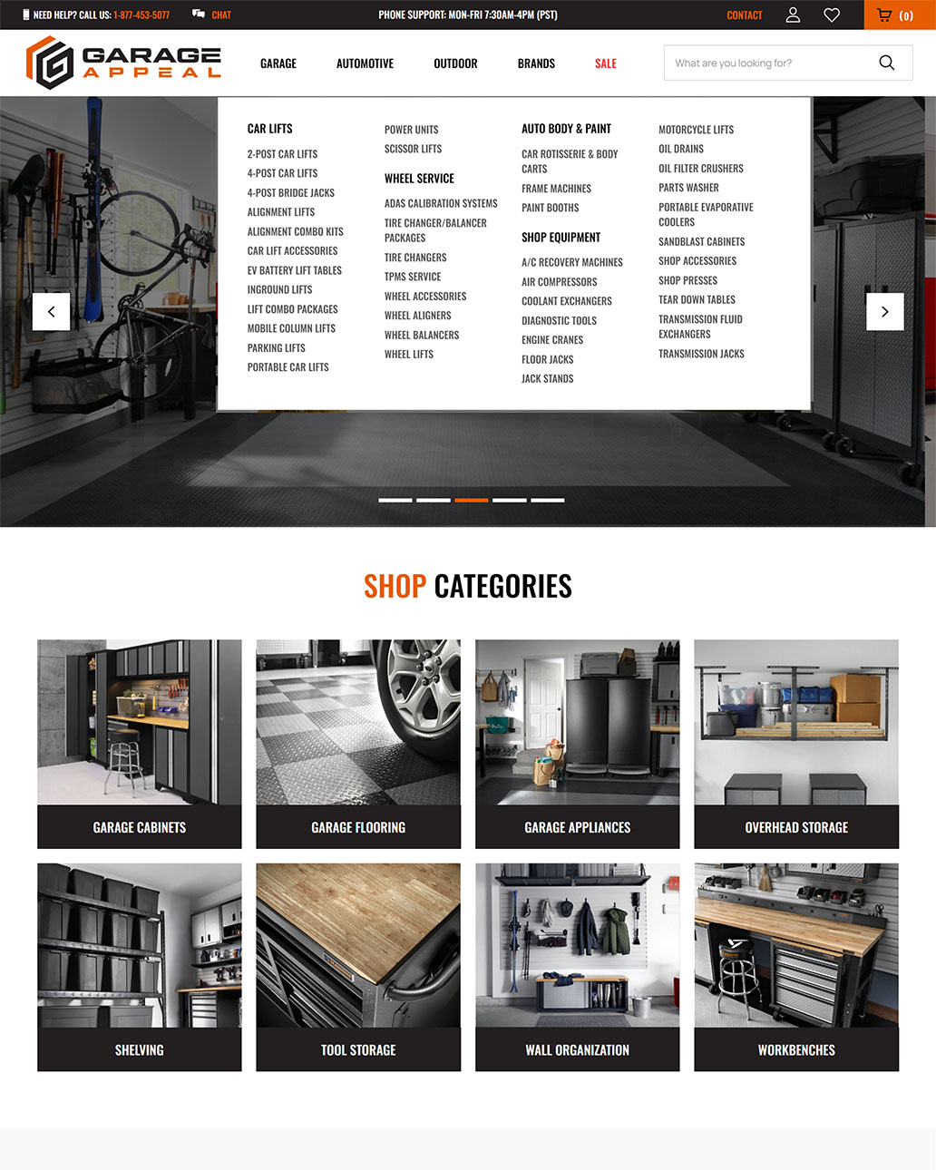
Information Architecture
The IA was remained mostly unchanged due to the already established organization of products and categories. However, our design introduced some new components to improve the user journey:
Risks and Challenges
Key challenges included:
Results / Outcomes
The redesign delivered three modernized, mobile-friendly ecommerce sites with cohesive branding. The approach reduced budget and timeline while improving usability across all three stores. The client expressed satisfaction during reviews and launch, with no major support needs afterward.
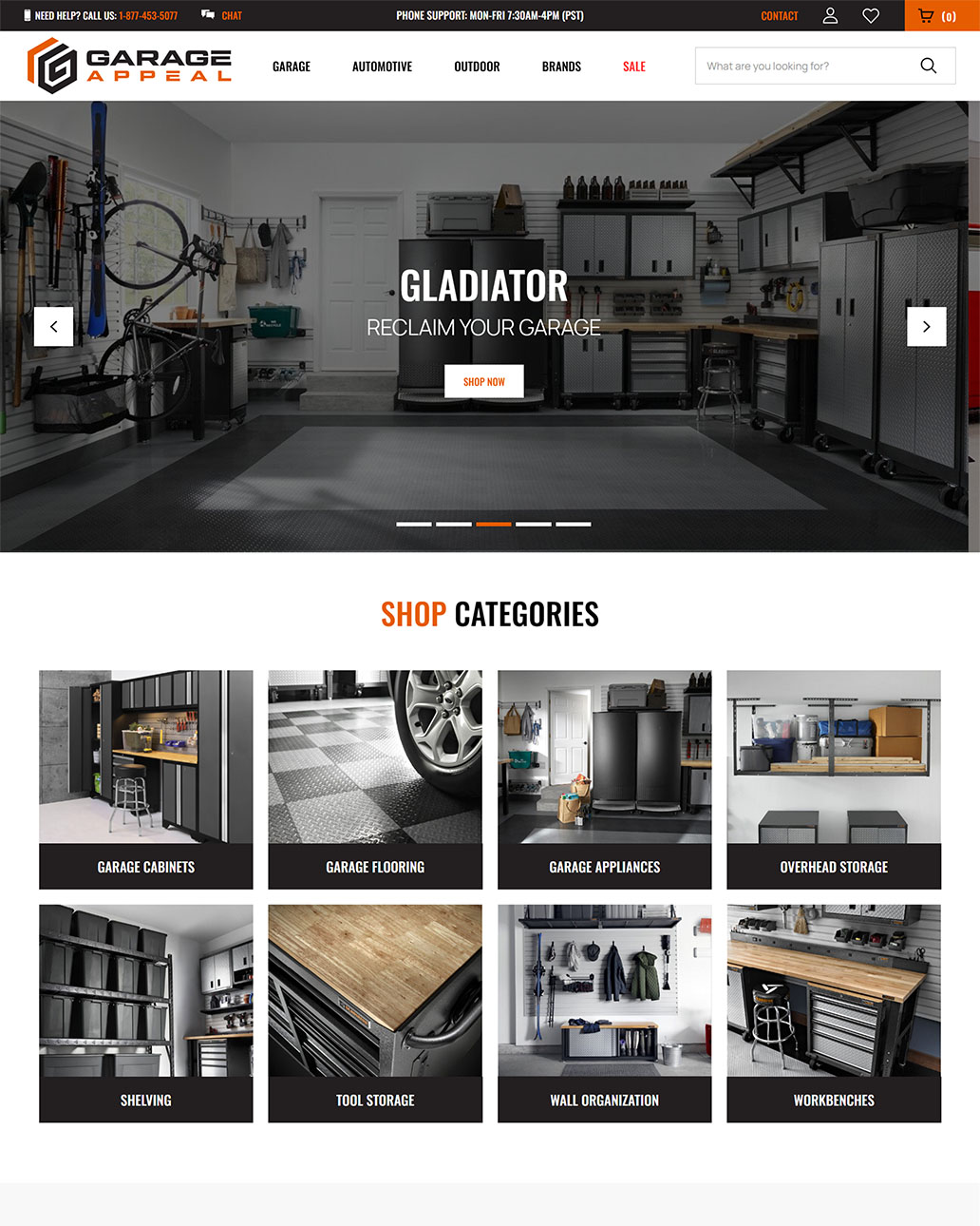
Multi-brand Design System
We achieved brand continuity through a shared design system which we applied to all three brand websites. Common elements like the header and navigation were paired with design patterns for fonts, button styles, callouts, and product/category layouts.
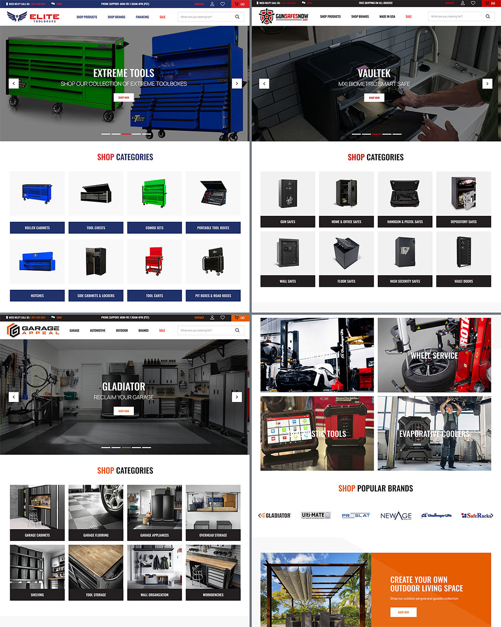
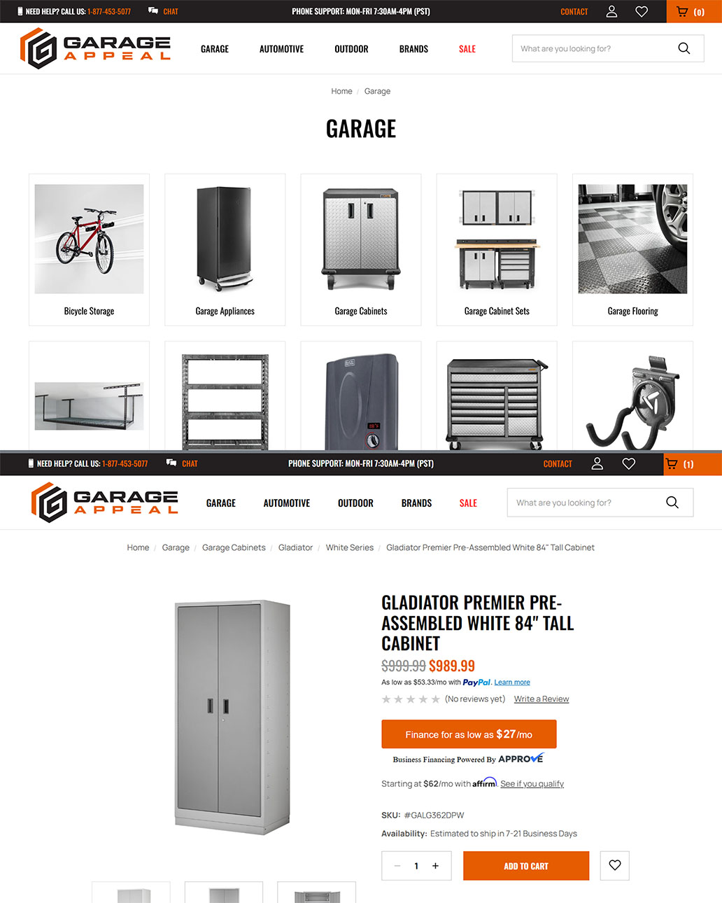
Neatly Organized Category and Product Pages
The new category and product pages templates effectively leveraged the bold fonts, brand colors, and professional product images to yield visually clear organization. Adequately sized touch targets helped ensure mobile usability.